


Ultimate Tips of Mixing Curtain Colors in Your Home

As the owner of Dolcewe.com for over 10 years, I've helped thousands of customers find perfect curtain color combinations.
The right curtain colors can change how your entire room feels. This guide will show you how to mix curtain colors like a pro.
You'll learn which colors work together and how to match them with your walls and furniture.
Key Takeaways:
- Start with a neutral base and add a showstopper fabric as the main focal point.
- Create balance by giving patterns space to breathe.
- Consider the color palette and use the 60-30-10 rule for proportionate distribution.
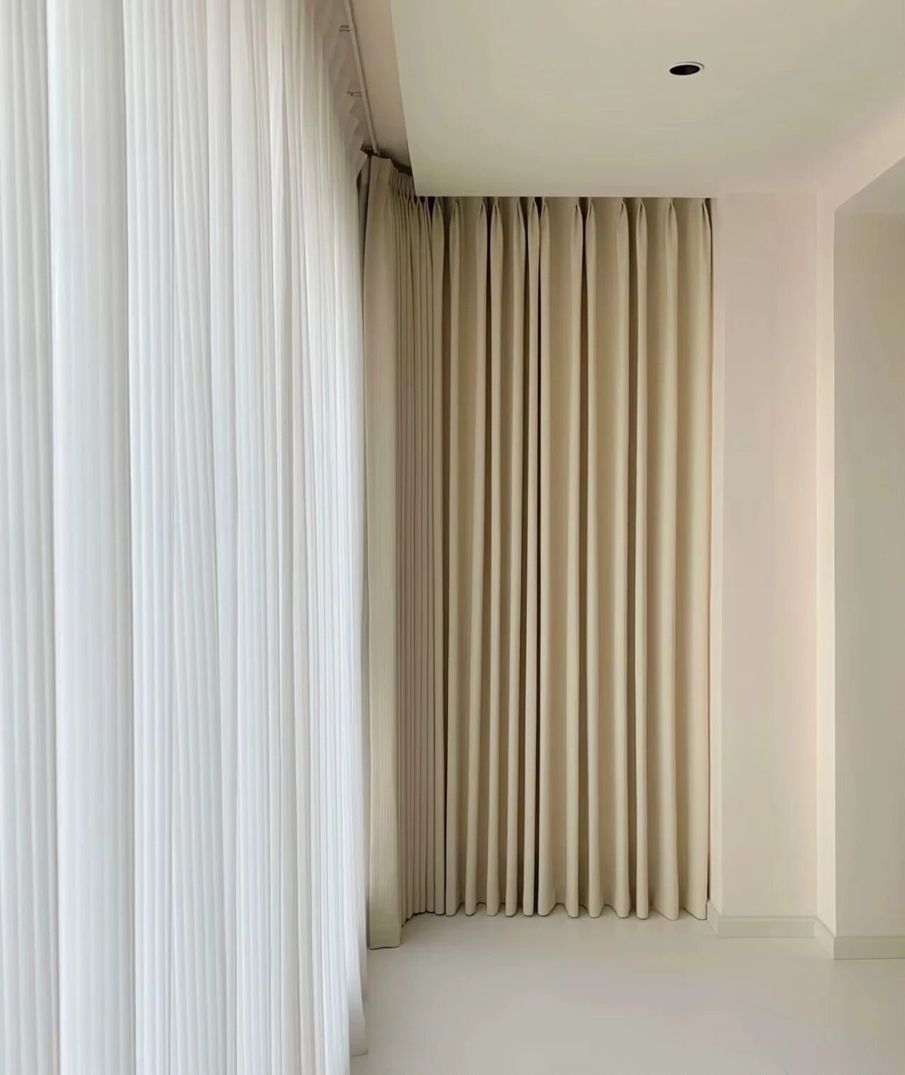
- Experiment with different hanging styles and consider layering curtains with varying lengths.
- Mix different curtain materials for added elegance.
With these expert tips and ideas, you'll be well on your way to creating stunning curtain color combinations that reflect your personal style and enhance the ambiance of your living space.
Why Curtain Colors Matter in Home Decor

Curtains do more than just block light. They add style and mood to your rooms. Think of curtains as large color blocks in your space. They can make a room feel bigger, cozier, or more exciting.
Your curtain colors can set the tone for your entire room.
- Bright colors add energy to a space.
- Soft, pale colors create a calm feeling.
- Dark colors can make a space feel smaller but more cozy.
I've seen many homes transformed by just changing curtain colors. One customer changed from beige to blue curtains. Her living room suddenly felt fresh and new. You can get this same effect in your home with the right color choices.
Choosing the Right Curtain Colors for Different Rooms
Each room in your home has a different purpose. The curtain colors should match that purpose. Let me show you what works best for each space.
Living Room Curtain Color Combinations

Your living room is where you spend lots of time. The curtains should make this space feel welcoming.
Neutral colors like beige, gray, and cream work well as a base. You can add one or two accent colors that match your furniture.
Do you have a blue sofa? Try curtains in cream with blue patterns. Is your living room very bright?
Consider curtains in deeper colors like navy or forest green. These colors can reduce glare while adding richness.
Here's a simple guide for living room curtain colors:
| Wall Color | Great Curtain Color Options |
|---|---|
| White or Off-white | Navy blue, emerald green, soft gray, mustard yellow |
| Beige or Tan | Burgundy, chocolate brown, sage green, burnt orange |
| Gray | Blush pink, teal, yellow, purple |
| Blue | White, cream, coral, light yellow |
| Green | White, cream, lavender, gold |
Bedroom Curtain Color Ideas

Your bedroom needs curtains that help you relax. Soft, cool colors promote better sleep.
Blues, greens, and lavenders work well here. If your bedroom gets morning sun, choose thicker curtains in darker shades.
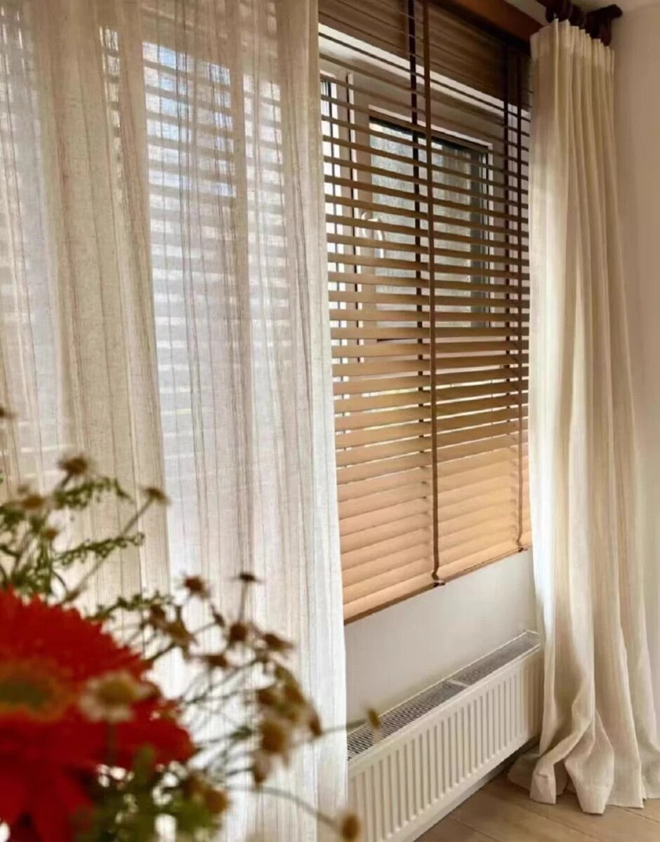
Do you want your bedroom to feel cozy? Try layering two curtain colors. You could use sheer white curtains under thicker blue ones. This gives you options for light control and privacy.
For kids' rooms, you can be more playful with colors. Just make sure they aren't too bright if sleep is an issue.
Kitchen and Dining Room Curtain Options

Kitchens look best with light, bright curtain colors.
Yellow, light blue, and mint green add freshness to cooking spaces. Short café curtains work well in kitchens. They let in light while giving some privacy.
For dining rooms, choose colors that make food look good. Avoid greens and blues that can make food look strange. Warm tones like gold, cream, or soft red create a nice dining mood.
The 60-30-10 Rule for Balanced Curtain Colors

Do you want to know a design secret? The 60-30-10 rule helps you balance colors perfectly. It works like this:
- 60% of the room is your main color (walls and large furniture)
- 30% is your secondary color (curtains and accent furniture)
- 10% is your accent color (pillows, art, and small items)
How to Apply the 60-30-10 Rule
Let's say your walls are light gray (60%). Your curtains could be navy blue (30%). Your accent pieces like pillows and rugs might be yellow (10%). This creates perfect balance.
Your curtains often make up that 30% color portion. They cover a large visual area. This is why picking the right curtain color matters so much.
You can flip this rule too. If your walls are bold, choose more neutral curtains. The key is finding the right balance for your space.
Matching Curtains with Wall Colors and Furniture
Your curtains should work with your walls and furniture. There are three main ways to match these elements.
Complementary Color Schemes

Complementary colors sit opposite each other on the color wheel. Blue and orange. Purple and yellow. Green and red. These pairs create strong visual impact.
Do you have blue walls? Try curtains in a soft orange or coral. The contrast will make both colors look more vibrant.
This approach works best when one color is more muted. A soft blue wall with burnt orange curtains looks better than bright blue with bright orange.
Monochromatic Color Options

Using different shades of the same color creates a calm, cohesive look. This is called a monochromatic color scheme.
For example, with gray walls, choose curtains in a lighter or darker gray. Add throw pillows in another gray shade. This creates depth without being too busy.
This approach works well in smaller rooms. It makes the space feel larger and more peaceful.
Contrasting Color Choices

Want a bold look? Try high-contrast pairings like black and white. This creates drama and visual interest.
White walls with black curtains make a strong statement. You can soften this with natural wood tones in your furniture.
Remember that high contrast can be tiring if overused. Balance it with some neutral elements.
Pattern Mixing Tips for Curtains
Mixing patterns can be tricky. But with a few simple rules, you can create amazing combinations.
Scale Variations in Patterns

Always vary the size of your patterns. If your sofa has a large floral design, choose curtains with a smaller pattern.
Here's how to mix patterns like a pro:
| Pattern Type | Best Paired With |
|---|---|
| Large florals | Small geometric prints or thin stripes |
| Bold stripes | Small dots or tiny repeating patterns |
| Plaid | Solid colors or very subtle patterns |
| Geometric | Organic shapes like florals or paisley |
Balancing Bold and Subtle Patterns
If one pattern is bold, the others should be more subtle. This creates balance. For example, bold striped curtains pair well with solid-colored furniture.
Does your room already have lots of patterns? Choose curtains in a solid color that picks up one shade from your existing patterns.
Curtain Material and Texture Considerations
The material of your curtains affects how colors look. Different fabrics reflect light in unique ways.
Sheer Curtains and Color Effects
Sheer curtains filter light in beautiful ways. Even simple white sheers can create a soft glow in your room.
Colored sheer curtains create a wash of color when light shines through. This effect can change throughout the day as the sunlight changes.
Try layering sheer curtains under heavier drapes. This gives you options for light control and privacy.
Blackout Curtains and Color Selection
Blackout curtains come in many colors now. They're not just black or navy anymore!
For bedrooms, consider blackout curtains in calming colors. Soft blues, greens, or grays work well. These colors block light while creating a restful mood.
At Dolcewe.com, our blackout curtains start at just $26.99. They come in custom sizes to fit any window perfectly.
Seasonal Curtain Color Changes
Changing your curtains with the seasons refreshes your home. You don't need new furniture to get a new look.
Summer and Spring Color Options

In warmer months, light, bright curtain colors create an airy feeling. Try these spring and summer favorites:
- Soft blues and aquas
- Light greens and yellow-greens
- Corals and peachy pinks
- Lavender and lilac
These colors feel cool and fresh when the weather is hot.
Fall and Winter Curtain Colors

When the weather turns cold, warmer curtain colors create coziness. Try these fall and winter options:
- Deep burgundy or wine colors
- Oliver green or emerald greens
- Navy blue or indigo
- Rich gold or amber tones
Thicker fabrics in these colors help keep heat in during colder months.
Common Mistakes to Avoid When Mixing Curtain Colors
I've seen some common curtain color mistakes over my years at Dolcewe.com. Let me help you avoid them:
Don't match curtains exactly to your wall color. This makes them blend in too much. Create some contrast for visual interest.
Avoid using too many bright colors together. This can feel chaotic. Instead, choose one bright color with more neutral companions.
Don't forget to consider your flooring. Your curtains can pick up colors from your floor for a cohesive look.
Skip trendy colors if you want longevity. Super trendy curtain colors may look dated quickly. Classic colors last longer.
Embrace Your Creativity and Enjoy the Process
The art of mixing curtain colors is all about embracing your creativity, exploring different design ideas, and enjoying the process of transforming your living space into a stylish and inviting haven. With a few simple tips and tricks, you can create stunning and unique curtain color combinations that will elevate the overall aesthetic of your home.
One popular design technique is to incorporate ombre curtains into your color scheme. These curtains feature a gradient effect, with one color fading into another. The result is a visually striking and modern look that adds depth and dimension to your windows. Whether you choose a subtle ombre or a bold and vibrant transition of hues, ombre curtains are sure to make a statement in any room.
Another technique to consider is color blocking curtains. This involves using curtains in contrasting colors to create bold and dramatic visual effects. For example, you can pair rich, jewel-toned curtains with neutral walls and furniture for a striking pop of color. Or, you can experiment with complementary colors to create a harmonious and balanced look. The key is to play with different combinations and find what resonates with your personal style.
Conclusion
Mixing curtain colors is an art form that can transform your home. To create stunning and harmonious curtain color combinations, start with a neutral base and introduce a showstopper fabric as the focal point.
Remember to give patterns room to breathe and use the 60-30-10 rule for proportionate distribution of colors. Experiment with different hanging styles and consider layering curtains of varying lengths.
Don't be afraid to mix and match different materials, such as sheer and opaque fabrics, to create a luxurious and elegant look.
At Dolcewe, you can find various curtains in different colors, fabrics, and patterns to mix your colors, all available in custom sizes starting at $26.99. Check our curtains collection today!
FAQ
Q: How do I mix curtain colors in my home?
A: To mix curtain colors in your home, start with a neutral base and add a showstopper fabric as the main focal point. Create balance by giving patterns space to breathe. Consider the color palette and use the 60-30-10 rule for proportionate distribution. Experiment with different hanging styles and layer curtains with varying lengths. You can also mix different curtain materials for added elegance.
Q: What patterns should I use when mixing curtain colors?
A: When mixing curtain colors, use patterns in different styles and scales. Consider using the most prominent pattern on the floor to anchor the space and build the color palette from there. Mixing patterns adds visual interest and creates a dynamic look in your home.
Q: How can I mix curtain colors without overwhelming the room?
A: To mix curtain colors without overwhelming the room, make sure to create balance in the space. Use the 60-30-10 rule to proportionately distribute colors. Incorporate neutral colors as the base and add pops of color through curtains and accessories. Consider the overall color palette of the room and choose curtain colors that complement the existing elements.
Q: Can I mix different curtain materials?
A: Yes, mixing different curtain materials can add depth and elegance to your space. Consider using sheer curtains to layer under heavier drapes or adding velvet curtains for a luxurious touch. Experiment with different textures and materials to create a unique and visually appealing look.
Q: Any tips for mixing and layering patterns?
A: When mixing and layering patterns, consider the color palette and make sure the patterns complement each other. Use patterns in different scales, such as a large floral pattern with a smaller geometric pattern. Layer curtains with varying lengths to create depth and visual interest. Don't be afraid to be bold and experiment with different combinations.
Q: How can I create a cohesive look when mixing curtain colors?
A: To create a cohesive look when mixing curtain colors, consider the overall style of the room and choose colors that harmonize with the existing elements. Use the 60-30-10 rule for proportionate color distribution. Find a common thread, such as a specific color or pattern, to tie everything together. Step back and evaluate the overall balance and harmony of the colors in the space.
Q: How can I incorporate trendy curtain color combinations?
A: To incorporate trendy curtain color combinations, consider using ombre curtains or color blocking techniques. Ombre curtains transition from one color to another, creating a stunning visual effect. Color blocking involves using contrasting colors in bold and geometric designs. Experiment with these techniques to add a modern and stylish touch to your space.
1 comment