


Curtain Color Matching Made Easy: Expert Tips for Every Room

Last Updated On 3/25, 2025
As James, owner of custom curtain store Dolcewe.com, I want to share the designer secrets of dressing windows.
Coordinating curtain colors can be challenging, but also transformative when done right.
This guide will show you how to match curtains with your walls, furniture, and floors. You'll learn about color basics, room-specific tips, and the newest trends for 2025.
I've made this guide simple and easy to follow, so you can transform your rooms with confidence.
Key Takeaways
| Section | Key Takeaway |
|---|---|
| The Basics of Curtain Color Matching | Colors affect mood and room perception. Use the color wheel to guide choices - colors next to each other create harmony while opposite colors create drama. |
| Matching Curtains With Wall Colors | Match curtains to walls for a spacious feel in small rooms. Choose contrasting colors to make windows stand out. When uncertain, neutral curtains (white, beige, gray) work with any wall color. |
| Living Room Curtain Ideas | Earth tones create warmth while bold colors add drama. Light-colored curtains make small living rooms feel bigger and reflect more light throughout the space. |
| Bedroom Curtain Colors | Choose soft blues, greens, or lavender to promote better sleep. Ensure bedroom curtains block light well - our blackout options come in these sleep-friendly colors. |
| Kitchen Curtain Colors | Bright colors like yellow add cheer while light blue creates a clean look. Consider café curtains that let in light while providing privacy at counter level. |
| Bathroom Curtain Suggestions | Select moisture-resistant fabrics in white, light blue, or green for a fresh feeling. Our polyester blend curtains resist mold and mildew in damp environments. |
| 2025 Curtain Color Trends | Sage green, terracotta, and dusty blue are trending colors for 2025. These colors work with both modern and classic homes while feeling fresh and current. |
| Seasonal Color Changes | Use light colors in spring/summer and warm, rich colors in fall/winter. You only need to swap panels in one or two rooms to update your entire home's feel. |
| Common Curtain Color Mistakes | Take photos of your room before shopping to match with existing furniture. Test fabric samples in your actual room lighting before buying - we offer free samples. |
| Steps to Choose Perfect Curtains | Determine your goal (make room bigger, cozier, calmer) to narrow down color choices. Always test fabric samples in your actual room at different times of day to see how lighting affects color. |
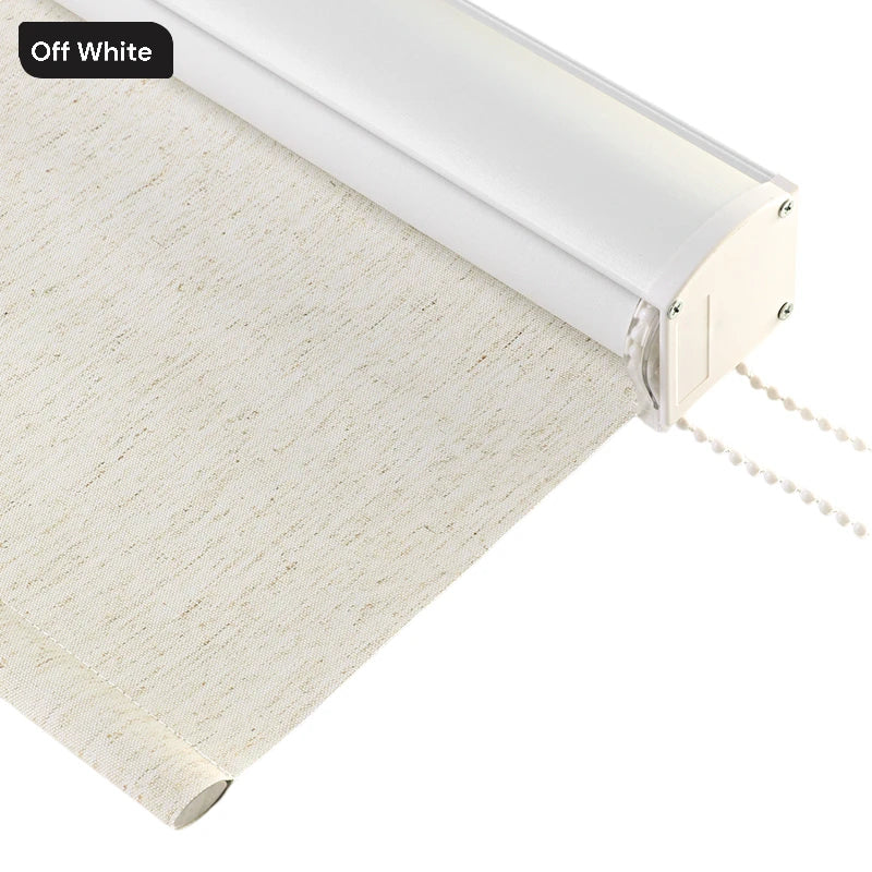
| How We Help at Dolcewe.com | We offer free color samples, custom sizes, and easy returns starting at just $26.99. Our team provides free color advice to help you find the perfect match for your space. |
Understanding Basic Color Rules for Curtains

Color matching doesn't have to be hard. I've spent years helping customers pick the right curtain colors. Let me share what works.
The Simple Color Wheel Explained
The color wheel helps you match colors in your home. It shows how colors relate to each other.
- Primary colors are red, blue, and yellow. These are the base colors.
- Secondary colors come from mixing primary colors. These include purple, green, and orange.
Here's a simple color guide to help you understand how colors work together:
| Color Type | Examples | Best Used With |
|---|---|---|
| Warm Colors | Red, Orange, Yellow | Add energy to rooms, good for social spaces |
| Cool Colors | Blue, Green, Purple | Create calm feeling, good for bedrooms |
| Neutral Colors | White, Gray, Beige | Work with any color, very flexible |
Colors next to each other on the wheel usually look good together. Colors across from each other create a bold look.
Did you know that picking the right color can change how you feel in a room?
How Colors Change Your Mood
The colors in your room change how you feel when you're there.
Blue and green curtains help most people feel calm. These work well in bedrooms where you want to relax.
Red and orange curtains make a room feel warm and full of energy. These might work in your dining room or living room.
Yellow curtains can make a room feel sunny and happy. Many people like them in kitchens.
Purple curtains can feel fancy or creative. Kids often like purple rooms.
What feeling do you want in your room? Pick your curtain color based on that.
Matching Curtains With Your Wall Colors

Many customers ask me how to match their curtains with their walls. Here are some easy ways to do it.
The Matching Method
Matching means using curtains that are the same color as your walls. This makes your room look bigger.
Do you have a small room? Try this method to make it feel larger.
Pick curtains that are the same color as your walls but in a different shade.
Have light blue walls? Try medium blue curtains. This creates a clean, smooth look.
The Contrast Method
Contrasting colors sit opposite each other on the color wheel. This creates a bold, eye-catching look. Do you want your windows to stand out? This method works great.
Have green walls? Try red or pink curtains for a strong contrast. Have blue walls? Orange or gold curtains will pop against them.
The Neutral Solution
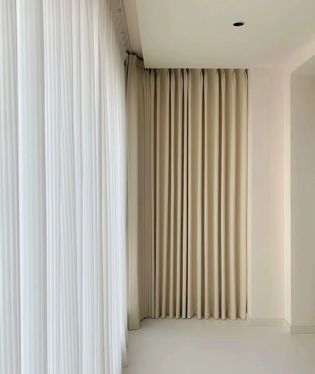
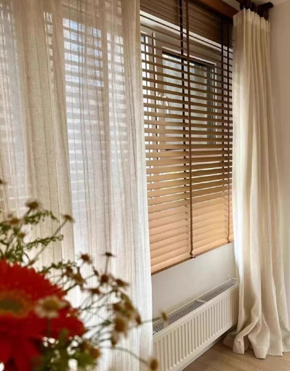
Neutral curtains work with any wall color. White, cream, gray, and beige curtains are safe choices. They match everything.
Are you unsure about color choices? Start with neutral curtains. They look good with any wall color. You can add colorful pillows or rugs to bring in color.
Best Curtain Colors for Different Rooms
Each room in your home has its own needs. Let me help you pick the right curtains for each space.
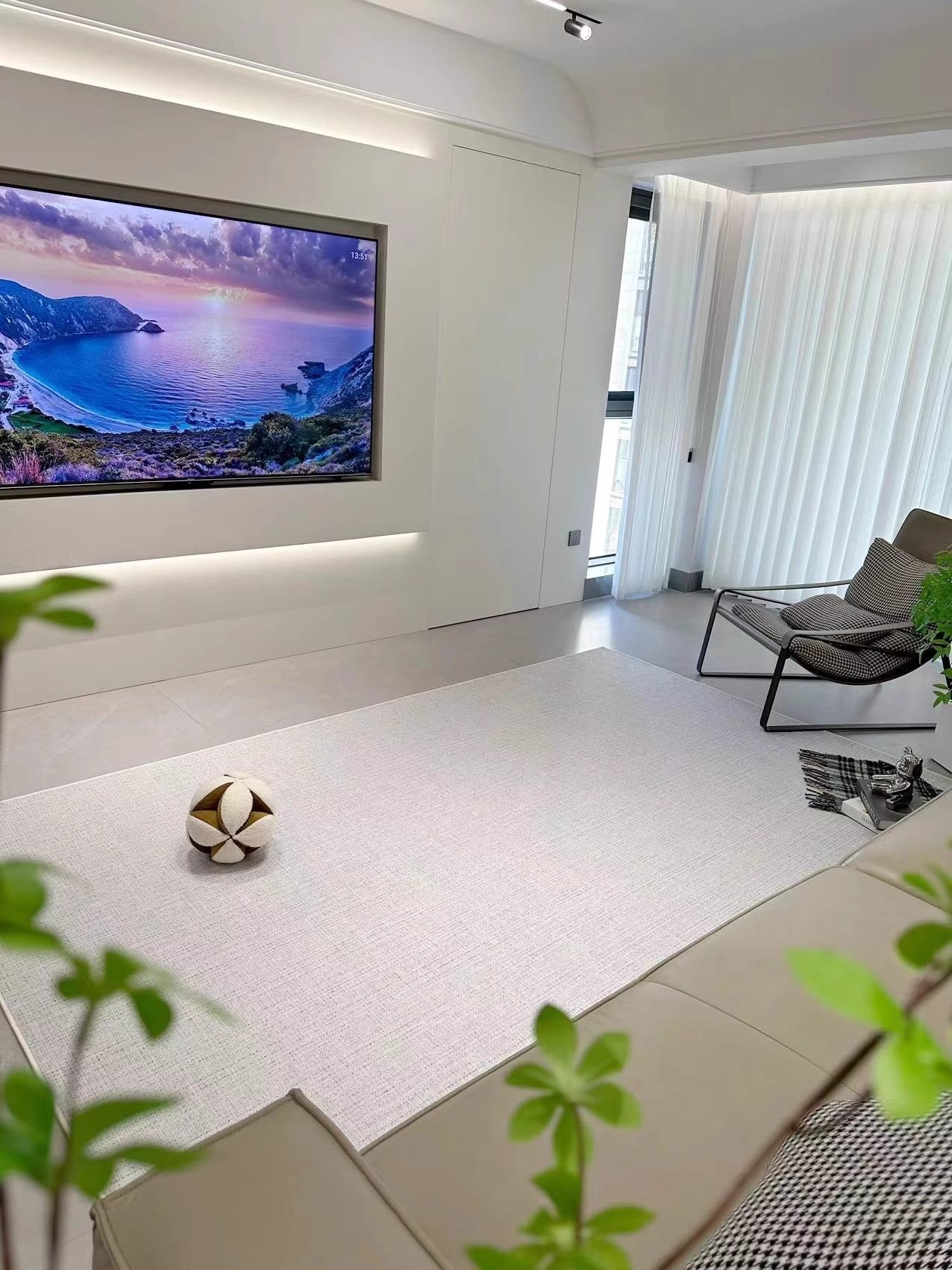
Living Room Curtain Colors

Your living room is where you spend time with family and friends. The curtains should make the room feel warm and welcoming.
Earth tones like brown, tan, and olive green work well in living rooms. They create a cozy feeling.
Bold colors like navy blue or burgundy can add drama to your space.
Do you have a small living room? Light-colored curtains make the room feel bigger.
Do you have large windows? Try layering sheer curtains with heavier drapes.
Bedroom Curtain Colors

Your bedroom is for rest and sleep. The curtains should help create a calm space.
- Soft blues and greens help you relax and sleep better.
- Lavender can also help with sleep.
- Want a romantic feeling? Try soft pink or rose curtains.
Make sure your bedroom curtains block light well. This helps you sleep better. Our blackout curtains come in many soft colors to match your bedroom.
Related Article - Master Bedroom Curtains Guide
Kitchen Curtain Colors

Kitchens look great with bright, happy curtains.
- Yellow adds sunshine to your kitchen.
- Light blue creates a clean, fresh look.
- Short curtains called café curtains work well in kitchens.
They let in light while giving some privacy. Do you have a white kitchen? Add color with bright curtain panels.
Bathroom Curtain Ideas
Bathrooms need curtains that can handle moisture.
- White and light blue create a clean feeling.
- Green reminds people of nature and feels fresh.
Choose curtain fabric that resists mold and mildew for bathrooms. Short curtains work well in bathrooms too. They stay dry and clean.
2025 Curtain Color Trends You'll Love
Keeping up with trends helps your home look current. Here are the hot curtain colors for 2025.
This Year's Most Popular Curtain Colors

Sage green is very popular this year. It brings nature indoors.
Terracotta and clay colors are also trending now.
Dusty blue is replacing navy in many homes. It's softer but still adds color. Are you looking for a trendy update? These colors are great choices.
Seasonal Color Choices for Your Curtains
Change your curtains with the seasons for a fresh look.
- Light colors work well in spring and summer. They feel airy and fresh.
- Warm, rich colors feel cozy in fall and winter.
Try amber, rust, or green. You don't need to change all your curtains. Just swap out panels in one or two rooms.
How Light Changes Your Curtain Colors

The light in your room affects how curtain colors look. Let me explain how this works.
Natural vs. Artificial Light
Natural light shows the true color of your curtains. But this light changes throughout the day. Morning light has a blue tone. Evening light looks more golden.
Artificial light affects colors too. LED lights make blues look brighter. Warm bulbs make reds and yellows look richer. Test curtain samples in your room's actual light.
Regional Light Differences
Where you live affects your light quality. Northern areas get cooler, bluer light. Southern regions get warmer, more golden light.
Live in a northern area? Warm curtain colors will balance the cool light. Live in a sunny southern region? Cool curtains can help balance the warm light.
Avoid These Common Curtain Color Mistakes
I've helped fix many curtain color problems. Learn from these common mistakes.
Mistake #1: Ignoring Your Existing Colors
Your curtains need to work with your furniture and floors. Don't pick curtains without thinking about these elements.
Take pictures of your room before shopping. Look at all the colors together. Do they share similar undertones? They should work as a team.
Mistake #2: Choosing Colors That Are Too Bright
Very bright curtains can be overwhelming. They might look good in the store but feel too strong at home.
Consider muted versions of your favorite colors. A soft sage instead of bright green. A dusty blue instead of electric blue. These colors last longer in your design.
Mistake #3: Forgetting About Fabric Texture
The texture of your curtains affects how the color looks. Shiny fabrics make colors look brighter. Matte fabrics make colors look softer.
Do you want a subtle look? Choose matte fabrics like cotton or linen. Want more drama? Silky or velvet curtains make colors look richer.
Simple Steps to Choose Your Perfect Curtain Colors
Let me give you a simple plan to find your ideal curtain colors. Just follow these steps.
Step 1: Take Photos of Your Room
Use your phone to take pictures of your room. Look at the colors of your walls, furniture, and floors. What colors are already there?
Make a list of these colors. They will help guide your curtain choice. It's easier to match curtains to your room than to change everything else.
Step 2: Decide on Your Color Strategy
Will you match your walls? Contrast with them? Or go neutral? Your choice depends on your goals for the room.
Want a calm space? Match your curtains to your walls. Want to add energy? Use contrasting colors. Not sure? Neutral curtains are always safe.
Step 3: Order Samples Before Buying
Never buy curtains without seeing the actual fabric in your room. Light affects how colors look. We offer fabric samples for all our curtains.
Place samples on your window at different times of day. How do they look in morning light? Evening light? With lights on? This extra step saves time and money.
Factors to Consider For Curtain Color Combinations
Choosing the right color scheme for curtains can be a daunting task. However, with some careful consideration, you can create a harmonious and visually appealing living space.
Here are some factors to consider when coordinating curtain colors:
Using the Color Wheel
The color wheel is a valuable tool when it comes to creating a harmonious color scheme for your curtains. Complimentary colors, which are opposite each other on the color wheel, can create a striking contrast and add depth to your curtains.
Analogous colors, which are adjacent to each other on the color wheel, can also create a harmonious look.
For example, if your walls are painted in a warm shade like yellow, consider selecting curtains in a complimentary cool shade like blue or green.

Matching Curtains with Walls Colors
Some homeowners prefer curtains that match the color of the walls to create a seamless and cohesive look. However, curtains matching your wall color can be limiting and tend to make a room feel boring
To create more visual interest, consider complementing the wall color with curtains in a different shade or selecting a contrasting color.
For example, use brown curtains for beige walls to create warmth and depth.
Related Article - Curtain Wall Colors Matching
Matching Curtains with Furniture and Decor
When you choose the right curtain color, it's important to consider the overall color scheme of your room, including furniture and decor.
Choose colors that harmonize well with your existing pieces to create a cohesive and stylish space. For example, if you have a bold-patterned sofa, consider choosing curtains in a neutral color, like white or beige, to balance out the room
Related Article - Curtain Furniture Color Matching
The Importance of Lighting
Lighting can significantly impact the way colors appear in a room. If your room has plenty of natural light, consider selecting curtains in a lighter shade to create a bright and airy atmosphere.
Alternatively, if your room has limited natural light, selecting curtains in a darker shade can add depth and create a cozy ambiance.
Neutral vs. Bold Colors
When choosing curtain colors, it's essential to strike a balance between neutral and bold shades.
Neutral colors like beige, white, and grey can harmonize with different color schemes and add a sense of elegance to any room. However, bold colors like red, blue, or green can add a pop of visual interest and create a focal point in the room. When selecting curtain colors, consider the room's overall style and choose colors that complement the existing decor.
By considering these factors, you can select the perfect curtain color scheme for your living space.

Curtains Matching with Furniture & Decor
When coordinating your window curtains with your furniture and decor, it's important to consider the overall color scheme of the room. Selecting curtains that complement the existing color palette can create a cohesive and visually pleasing space.
One approach is to select curtains that match the color of the furniture or decor. For example, if your sofa is a navy blue, consider selecting curtains with a similar shade of blue. This can create a harmonious look that ties the room together.
Alternatively, you can choose curtains that complement the existing color scheme. For instance, if your room has a neutral color scheme with beige walls and a cream-colored sofa, consider selecting curtains in a warm shade like rust or terracotta. This can add a pop of color and visual interest to the space.
When selecting curtains to match furniture, it's important to pay attention to the fabric texture as well. If your sofa has a smooth leather texture, consider opting for curtains with a rougher texture like linen or burlap. This can add depth and dimension to the room.
Overall, the goal is to create a cohesive look that ties all the elements of the room together. By selecting curtains that match or complement the furniture and decor, you can achieve a harmonious and visually appealing space.

The Versatility of Neutral Colors Curtains
Neutral colors are a great choice for coordinating curtain colors, as they can harmonize well with different color schemes and add a touch of elegance to any room. White curtains, beige curtains, and gray are popular neutral colors options that you can choose from.
When using neutral colors, it's important to add a pop of color to avoid making the curtains look dull or boring. You can do this by incorporating colorful cushions or contrasting curtains with bold patterns. These will create a lively and inviting atmosphere, while also maintaining the overall harmony of the room.
If you prefer a minimalist aesthetic, you can use only neutral colors for your curtains and achieve a clean and sophisticated look. You can also experiment with different shades of neutral colors to create depth and texture.
Remember that lighting is an important factor when coordinating curtain colors. Neutral colors can appear different under different lighting conditions, so make sure to consider the impact of natural and artificial lighting on your color scheme.

Overall, neutral colors offer a lot of versatility and can be a great choice for anyone looking to harmonize their curtains with their existing decor.
Adding Visual Interest with Patterns
Patterns can add a playful touch to your curtains, making them a unique and eye-catching addition to your space. When incorporating patterns into your curtain color scheme, consider the existing color palette of your room. Select patterns that complement the colors already present in your decor.
One strategy for selecting patterns is to use a color wheel to choose complementary colors. For example, if your walls are painted in a warm color such as orange, consider using blue or green patterned curtains to create a striking contrast that still harmonizes with the room.
Another tip is to use patterned curtains with neutral walls to create a focal point in the room. A bold pattern, such as stripes or florals, can draw the eye and add visual interest to an otherwise simple space.
When choosing patterns, also consider the scale of your curtains and the size of the room. Large patterns or bold colors may overwhelm a smaller space, while smaller patterns or subtle hues may get lost in a larger room.

Don't be afraid to get creative with your curtain patterns and combinations. Mixing and matching different patterns, such as stripes and polka dots, or pairing patterned curtains with solid-color throw pillows, can create a fun and playful look.

Tips for Coordinating Curtain Colors on a Budget
Coordinating curtains on a budget can be challenging, but it's not impossible. With a few tips and tricks, you can harmonize your curtain colors without breaking the bank.:
- Shop Dolcewe: Dolcewe offer custom size for all curtains which are available in various fabrics, colors and patterns. All curtains are starting at $26.99!.
- DIY curtains: If you have basic sewing skills, consider making your own curtains. This can be a cost-effective way to ensure that your curtains perfectly match your decor.
- Mix and match: Instead of buying multiple sets of matching curtains, consider mixing and matching colors and patterns. This can create a unique and visually interesting look for your home.
- Consider neutrals: Neutral colors are not only versatile but can also be cost-effective. Consider beige, white, or grey curtains as they can be easily paired with any color scheme.
- Reuse curtains: Before buying new curtains, consider reusing curtains you already own. A simple color change can add a fresh look to any room without having to spend extra money.
With these tips, you can coordinate your curtain colors on a budget while still maintaining a stylish and cohesive look for your home.
Choose Curtain Colors for Different Interior Styles
When it comes to coordinating curtains colors, different interior styles require different approaches. Whether you're going for a modern, traditional, bohemian or minimalist look, harmonizing colors with curtains can be challenging.
Modern
Modern interior styles often incorporate neutral colors such as grey, white, and black.
For a modern look, consider using curtain combinations with clean lines and solid colors that match or complement your wall color.
Traditional
For a traditional interior style, consider curtains with intricate patterns and rich colors like burgundy, navy, and gold.
Velvet curtains can create a clean look and drama to a traditional space
Bohemian
Bohemian styles are often associated with bright, bold colors and patterns.
For a bohemian look, consider using curtains with vibrant colors and intricate patterns. You can also layer curtains to create a cozy, eclectic feel.
Minimalist
Minimalist styles often favor simplicity and clean lines. For a minimalist look, consider using curtains with solid, muted colors like black, white, or beige.
Simple designs with natural textures like linen or cotton can also complement a minimalist style.
No matter what interior style you choose, remember that coordinating curtain colors is not an exact science. It's all about finding the right balance between your curtains, furniture, decor, and wall color.
With these tips and tricks, you'll be able to create a cohesive and visually appealing space that reflects your unique style.
Conclusion
We hope this guide has helped you unlock the designer secrets to flawlessly coordinating curtain colors. With factors like the color wheel, decor harmony, strategic patterns and lighting in mind, you can now create showstopping, cohesive spaces and match your curtain to your interior design.
Don’t be afraid to experiment until you find your perfect palette. And know that thanks to Dolcewe's customizable high-quality curtains, available in a spectrum of fabrics, styles and colors starting at just $26.99, achieving these looks won't break the bank.
Explore the possibilities with Dolcewe's made-to-order curtains today. Enjoy free shipping on $199 orders plus 10% off your first order, making stunningly coordinated windows more attainable than ever.
The power to transform your rooms through color coordination is now in your hands. Happy decorating from all of us at Dolcewe
FAQ
Q: What are some tips for coordinating curtain colors?
A: Some tips for coordinating curtain colors include using the color wheel to create harmonious combinations, matching curtains with the walls or furniture, and considering the overall color scheme of the room.
Q: Should curtains exactly match the walls?
A: It depends on the desired effect. While matching curtains with the walls can create a seamless look, using a different color for the curtains can add an interesting contrast and visual interest.
Q: How can I coordinate curtains with my furniture and decor?
A: When coordinating curtains with furniture and decor, consider selecting curtain colors that complement the existing colors in the room. This can create a cohesive and visually pleasing space.
Q: What are some versatile neutral curtain colors?
A: Some versatile neutral curtain colors include white, beige, and gray. These colors can harmonize with various color schemes and add a touch of elegance to any room.
Q: How can patterns be incorporated into curtain color schemes?
A: Patterns can be added to curtain color schemes by selecting curtains with complementary patterns and colors. This can add visual interest and depth to the overall look of the curtains.
Q: Do different rooms require different approaches when coordinating curtain colors?
A: Yes, different rooms may require different approaches when coordinating curtain colors. Factors such as the function of the room and its overall aesthetic should be taken into consideration.
Q: What should I consider when it comes to curtain color trends?
A: When considering curtain color trends, it's important to stay up-to-date with the latest trends. This can help you incorporate trendy colors into your home decor and maintain a modern look.
Q: How can I coordinate curtain colors on a budget?
A: Coordinating curtain colors on a budget can be achieved by using affordable materials, exploring DIY options, and focusing on harmonizing colors rather than expensive brand names.
Q: How does lighting impact curtain color coordination?
A: Lighting plays a significant role in how curtain colors appear. Different lighting conditions can affect the perception of colors, so it's important to consider lighting when coordinating curtain colors.
Q: How can I coordinate curtain colors for different interior styles?
A: Coordinating curtain colors for different interior styles involves understanding the color palettes and aesthetics associated with each style. This can help create a cohesive and harmonious look.